Overview #
Every appearance setting for a channel lives in one place:
- Open the channel in the admin panel and click Edit Channel.
- Choose Style in the section list on the left (or from the accordion on mobile).
- Work through the three sub-tabs, watching the preview beside the form.
- Click Save. Nothing is applied to your public page until you do.
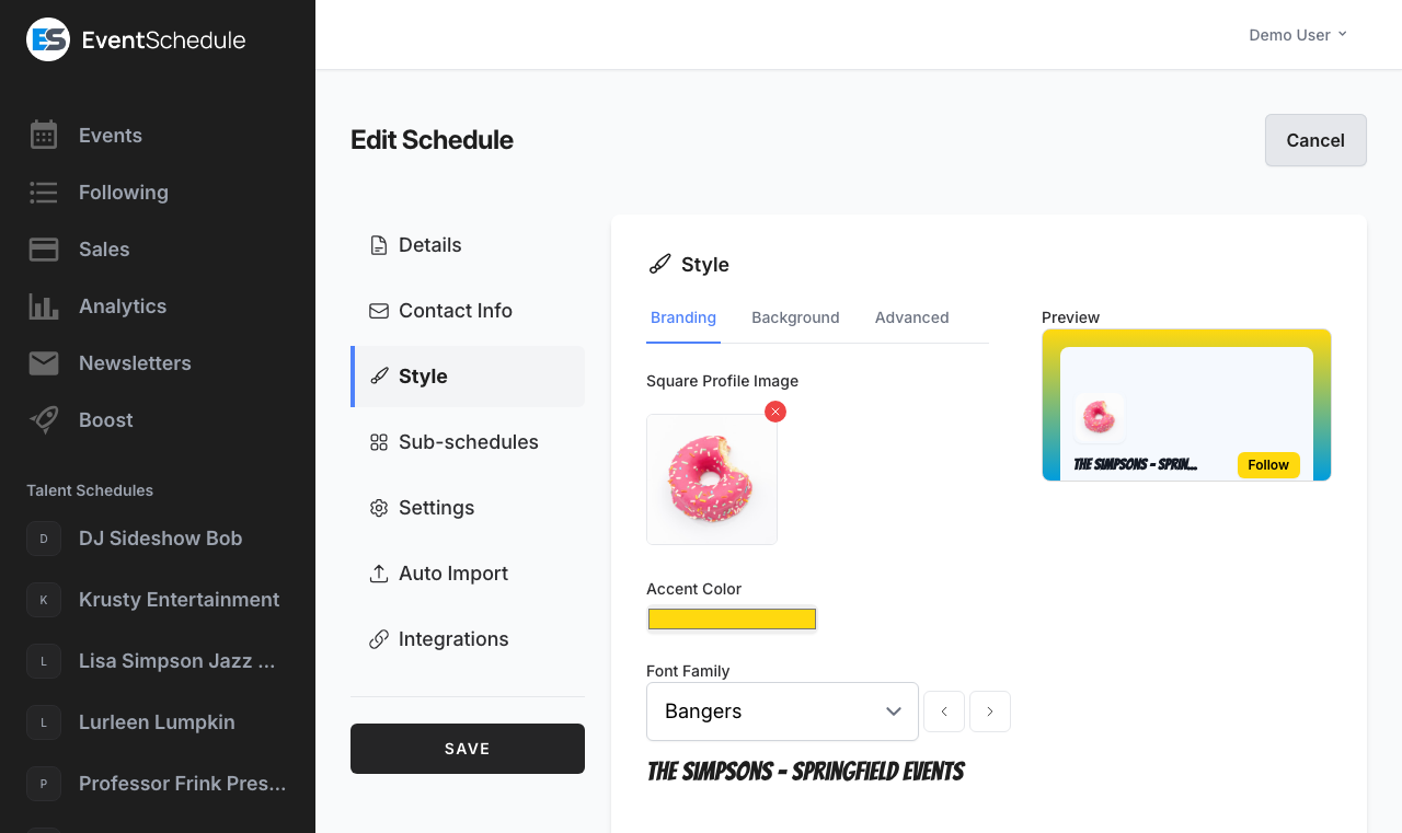
The Style section is split into three sub-tabs:
| Sub-tab | What it holds |
|---|---|
| Branding | Square Profile Image, Accent Color, Font Family, Event Animation |
| Background | Background Type (Gradient, Solid or Image) and the controls for whichever you pick: gradient colors and rotation, a solid color, or a background image |
| Advanced | Header Style, Header Image, Default Layout, Custom CSS |
New here?If you have not created your account and first channel yet, start with Getting Started. To set the channel’s name, description, links and other non-visual details, see Creating Channels.
Event Layout #
Choose how your events are displayed on your channel page, under Edit Channel → Style → Advanced → Default Layout. Two layouts exist:
Calendar #
Events laid out on a month grid, one cell per day, loaded one month at a time. Best when the shape of the month matters, such as a venue with something on most nights.
List
Events in date order as full-width cards, loaded well beyond the current month. Best when each event deserves its own space, or when they are spread thinly across the year.
This is only the default. Visitors can switch between the two with the layout toggle in the header, and their choice is remembered in their own browser for that channel. It never changes what anyone else sees, and it does not change your setting.
Per-embed overrideEmbeds ignore the visitor’s saved preference, so the site doing the embedding stays in control. An embed can also override your default with
?layout=calendaror?layout=list, so one page can carry the same channel twice in both layouts. See Embed URL Parameters.
Header Style #
Choose how the header appears at the top of your public channel page under Edit Channel → Style → Advanced → Header Style. Channels use Banner unless you change it, and the live preview updates as you switch between the two.
Banner #
A large header carrying your header image, a prominent logo, the channel name, description and social links. The most spacious option, and the only one that can show a header image or a logo wall.
Compact
A slim full-width bar at the top of the page with a small logo and the channel name on one side, and the action cluster on the other: follow, submit and manage buttons, the filter button, and the calendar or list toggle. Your description and social or contact links move to a strip just beneath the bar.
Header image and CompactThe header image applies to the Banner style only. Compact draws no header image at all, but nothing is lost: the description and social links appear in the strip below the bar. If a channel was set to the old Minimal style, it now reads as Compact, which is the same slim row under a clearer name.
Profile Image #
Upload a logo, photo or avatar that represents your channel under Edit Channel → Style → Branding → Square Profile Image. It does three jobs:
Your header #
A large logo in the Banner header style, or a small square avatar beside your name in the Compact style.
Your social preview
It becomes the preview image when your channel page is shared to a chat app or social network, unless your header image is one you uploaded, which is wider and so goes first. With neither, a background image you uploaded is used, and with none of them the page offers no preview image, so most apps show the link without a picture (Facebook may pick one from the page itself). It is never an EventWillow image.
Talent and venue logo walls
It is the logo other channels show for you in their logo wall header. A connected channel with no profile image is skipped there.
Best practicesUse a square image (1:1 aspect ratio). Recommended minimum size is 400×400 pixels. PNG and JPG are accepted, and uploads must be under 2.5 MB. Use the small red cross on the thumbnail to remove an image you have already saved.
It becomes your favicon too Pro – Requires the Pro plan #
On Pro, your profile image also becomes the icon in the browser tab on your public pages, including ticket pages. On every plan it becomes the home-screen icon when a visitor saves your channel to their phone, and a channel that has uploaded no image gets a plain calendar glyph there rather than the EventWillow logo. Nothing to configure: upload a profile image and it is used automatically. This is the same reason a square image matters, since a tab icon is cropped to a square either way.
Header Images #
The Header Image dropdown on the Advanced tab creates the visual banner at the top of your channel page. It offers four kinds of option, in this order:
None #
The default. A cleaner look with no header image, so your profile image and name take centre stage.
Venue logo wall (or Talent logo wall)
A grid of logos instead of a picture. On a talent or curator channel the option is called Venue logo wall and shows the venues hosting your approved events; on a venue channel it is called Talent logo wall and shows the talent performing at them. Each logo links to that channel’s page, and you can drag the list under the dropdown to set the order. Only connected channels that have a profile image appear, so the wall stays empty until at least one does, and the edit page warns you when that is the case.
Custom
Upload your own header. Use a wide image, around 1200×400 pixels or a similar aspect ratio. PNG or JPG, under 2.5 MB. It is also the picture a shared link to your channel shows, ahead of your profile image.
31 preset headers
Ready-made headers listed alphabetically, including 5am Club, Arena, Fitness Morning, Music Potential, Networking and Bagels, Ready to Dance, The Stage Awaits and Yoga and Wellness. Use the arrows beside the dropdown to flick through them with the preview open.
Needs the Banner header styleHeader images and the logo wall are drawn by the Banner header style only. Choosing one while the channel is set to Compact has no visible effect.
Background Options #
The Background tab starts with a Background Type choice of Gradient, Solid or Image. Picking one reveals its own controls and hides the others.
Gradient #
Pick a preset from the searchable Colors dropdown, or choose Custom at the top of it to mix your own.
Preset gradients
Over 380 named gradients from uiGradients, listed alphabetically: Cosmic Fusion, Emerald Water, Netflix, Omolon, Purple Dream, Sunset and many more. The arrows beside the dropdown step through them so you can watch the preview change.
Custom two-color gradient
Choosing Custom reveals two color pickers and a swatch of the result, so you can match your brand colors exactly.
Rotation
A slider from 0 to 360 degrees sets the gradient angle, so you can make it vertical, horizontal, diagonal or anything between. It applies to preset and custom gradients alike.
Solid #
A single Background Color picker. Use your operating system’s color picker or type a six-digit hex code such as #1a1a2e.
Image #
37 preset backgrounds
Ready-made backgrounds listed alphabetically, including Abstract Sunrise, Bookshelf, Desert Retreat, Flower Field, Greyscale, River of Dreams and Stormy Night. Selecting one shows a thumbnail below the dropdown.
Custom upload
Choose Custom at the top of the dropdown to upload your own. PNG or JPG, under 2.5 MB. Dark, low-contrast images work best, because your event cards and text sit on top of them.
Color Scheme #
One Accent Color picker on the Branding tab drives every highlighted element on your public pages. New channels start on a standard blue.
Where it appears #
Buttons and calls to action, the follow and submit controls, the calendar and list layout toggles, the filter button, and highlights on your event pages.
Text on top of it is calculated
EventWillow measures the brightness of your accent color and puts black text on light accents and white text on dark ones, so a button label stays readable whatever you choose. There is nothing to set.
AccessibilityThe automatic black-or-white text keeps buttons legible, but it cannot rescue an accent that disappears into your background. Check the preview with your chosen background, and pick a saturated color that clearly separates from it.
Typography #
The Font Family dropdown on the Branding tab offers more than 230 Google Fonts. It sets the typeface for your channel name and headings on your public pages.
Finding a font #
The dropdown is searchable, so you can type a name you already know. The arrows beside it step to the previous or next font alphabetically, which is the quickest way to browse.
Live sample
Your channel’s own name is rendered in the chosen font directly under the dropdown, and the preview panel updates too, so you can judge readability on your real text before saving.
Event graphics use their own fontThis setting styles web pages. Event graphics are drawn as images on the server with a bundled Noto Sans family (including Hebrew and Arabic variants), so changing your font here will not change them.
Event Animation #
Event Animation on the Branding tab brings your events to life as visitors scroll your channel: each event card animates into place as it comes into view, then its details follow one after another: the title, the date (which flips down like a tear-off calendar page), the venue, the price and the performers. The first screen plays as an entrance when someone opens your link. It is off (None) until you pick a style, and it is available on every plan.
| Style | Mood | What visitors see |
|---|---|---|
| Rise | Clean | Events float gently into place, their details rising in a soft wave while the image settles. |
| Focus | Dreamy | The image sharpens first, then each line of text comes into focus in turn. |
| Slide | Energetic | Events glide in from the side, each detail following like a ticker, with the text and the image meeting in the middle. |
| Deal | Playful | Events land like playing cards being dealt, then the venue and ticket badges are dealt onto the card and the performers pop in. |
| Shine | Glowing | A sweep of your accent color lights up each event, and every badge glints as the light passes. |
| Curtain | Theatrical | Panels in your accent color pull back to reveal each event’s image, and the text is unveiled line by line. |
Preview before you save #
The preview above the styles plays your choice on your own events, in your accent color and font, and updates as you change them. Use Replay to watch it again, or See it on your channel to open your real page with the style you picked, even before saving.
Phones and computers
Phones always list your events, so they always show the animation. On a computer it plays in the list layout; if your default layout is Calendar, visitors see it after switching to the list. The setting offers a one-click switch to the list layout.
After you save a new style, the Channel tab shows your link with a Copy button (and Share, where the device supports it), ready to send to your audience.
Always easy to readVisitors who turn off animations on their device, or with the accessibility menu on your channel, see every event right away with no motion. Events a visitor has already scrolled past, returns to with the back button, or prints are never hidden or replayed.
AI Style Generator Enterprise – Requires the Enterprise plan #
Enterprise featureEnterprise – Requires the Enterprise plan AI style generation needs the Enterprise plan. A selfhosted install counts as Enterprise, so nothing here is held back by plan there, but it does need its own AI keys (see below).
Let AI put together a coherent look for your channel from its name, type and description, so the color, font and images belong to each other rather than being chosen one at a time.
- Click AI Generator in the top-right corner of the Style section header.
- Tick which of the five elements to generate: profile image, header image, background image, accent color, or font. The dialog marks the ones you have already set, so you can leave them alone.
- Optionally add style instructions, for example “modern and minimal with blue tones”. Tick the box to save them for next time.
- Generate, then review the previews in the dialog. Accept drops the results into the Style form, Discard throws them away, and nothing reaches your public page until you click Save on the form itself.
Color and font come first #
The accent color and font are generated in one step, then the images are generated with that color passed in, so they share a palette. If you leave the profile image out of the selection, the existing one is described to the model instead, so a new header still matches it.
Daily limits
On the hosted platform, AI text and AI image generation each have a daily allowance per channel, shared with the other AI features. A selfhosted install has no such limit. AI generation is disabled in demo mode.
Selfhosted API keysSelfhosted installs supply their own keys. The accent color and font need a Gemini API key. Image generation uses an OpenAI API key when one is set and falls back to Gemini when it is not, so a Gemini key alone is enough to use every part of the generator. The button does not appear at all until at least one key is configured.
Remove Branding Pro – Requires the Pro plan #
Free channels on eventschedule.com carry a small “EventWillow” credit chip in the corner of their public pages. There is no switch for it: it is removed automatically the moment the channel is on Pro or Enterprise, and it returns if the plan lapses. The one exception is an Enterprise plan an admin granted by hand, which keeps it.
What a paid plan removes #
Five surfaces at once: the corner chip, the “create your own” card on your event pages, the credit line printed under your embed snippets, the same line inside a ticket or RSVP embed, and the footer of your newsletter emails. Ads, where a platform runs them on free channels, follow the same tier. Embeds of your calendar never carry any of it, on any plan.
White-label your channel
With those gone, a hosted channel reads entirely as your own to visitors. Pair it with a custom domain on Enterprise and nothing on the page points back at EventWillow. Event graphics are the exception: an image generated on the hosted platform carries a small eventschedule.com credit in its bottom-right corner on every plan.
A single-tenant selfhosted install has no plan tiers at all, so the event-page card, the embed and newsletter lines and ads are all absent by default, with nothing to buy. If instead you run your own multi-tenant platform on EventWillow, those surfaces follow each tenant’s tier exactly as they do on eventschedule.com, and your free tier also carries a footer strip pointing at your own marketing site, because that strip is the growth prompt of whoever runs the platform.
On every install that is not eventschedule.com itself, upgrading never removes that corner chip. It is the attribution the Attribution Assurance License asks for in return for the application, so there is no setting that removes it. On a single-tenant selfhost it is on every page. On a platform of your own it is on every channel you charge for, and a free channel there carries the operator’s footer strip in its place, because a page never shows both credits at once.
Custom CSS Pro – Requires the Pro plan #
Pro featurePro – Requires the Pro plan The Custom CSS box is editable on Pro and Enterprise, and on selfhosted installs, which count as Enterprise. Below Pro the box is shown read-only: CSS you saved earlier is kept, not deleted, but it is not applied to your pages until the channel is back on Pro, when it also becomes editable again.
When the built-in controls do not reach far enough, write your own CSS under Edit Channel → Style → Advanced → Custom CSS. It is added to every public page drawn in your channel’s own style: your channel page, event pages, embeds, and the pages visitors reach from them such as booking, event requests and gift cards. Ticket, order and installment payment pages use the app’s standard layout, so your CSS does not reach them.
- Override any of the built-in styles for complete control
- Fine-tune spacing, borders, radii and shadows
- Add your own animations and effects
- Up to 10,000 characters per channel
What the sanitizer stripsSaved CSS is cleaned before it is stored, so a few constructs are silently removed rather than rejected with an error. Do not rely on
@import,@font-face,@charset,expression(),javascript:URLs,behaviororbinding, or anyurl()pointing at anhttp:,https:ordata:address. Everything else, including modern layout and animation properties, is kept as written. If a rule seems to vanish after saving, check it against that list first.
Hiding Sections Pro – Requires the Pro plan #
Every panel on your channel page and on your event pages carries a stable id that starts with gp-. To remove one from the public page, add a display: none rule for that id in Edit Channel → Style → Advanced → Custom CSS. Nothing else has to change, and you can put back what you hid by deleting the line.
#gp-talent-list { display: none; }Two panels have their own switchThe “Notify me when tickets go on sale” card is off unless you turn it on, and the Stay up to date sign-up panel can be turned off. Both switches are under Settings → Advanced and work on every plan, so neither needs CSS.
A common example #
The performer list is the compact list of names under the Talent heading, for acts that were typed in or picked up by AI import and have no page of their own. If the names on your events are often wrong or incomplete, hide the list and let the event description carry the lineup instead.
#gp-talent-list { display: none; }Rules can be combined, and one rule can hide several panels at once:
#gp-upcoming-events,
#gp-talent-list,
#gp-reviews {
    display: none;
}
Hiding a panel is not the same as turning a feature offA
display: nonerule removes a panel from the page. It does not disable what sits behind it. People who already signed up to be notified are still notified, a hidden subscribe panel still accepts a submission posted to its address, and a hidden reviews panel does not delete the reviews. Where a real on/off setting exists, use that instead: videos, fan photos, fan comments, feedback, carpooling, accommodation and the “Notify me” card each have their own switch on the channel edit page, and the sponsor grid disappears on its own once you remove the logos. The Show Sign-Up Panel switch is the exception: like this rule, it only hides the panel, and sign-ups through your follow link, and on eventschedule.com the Follow button, still arrive.
Channel page sections #
| ID | Section |
|---|---|
#gp-announcement | Your announcement bar |
#gp-language-switcher | The language switcher row |
#gp-header | The whole header card or bar |
#gp-header-image | The header image behind the name |
#gp-logo-wall | The logo wall header |
#gp-profile-image | The profile picture tile |
#gp-header-body-mobile, #gp-header-body-desktop | Name, description, social links and buttons inside the header. Two ids because the header is laid out separately for narrow and wide screens, so hide both. |
#gp-below-bar | The description and contact strip under the compact header |
#gp-video-carousel | The strip of videos from upcoming events |
#gp-sponsors | The sponsor logo grid (also on event pages) |
#gp-events | Everything from the events heading down, including the calendar |
#gp-calendar | The calendar or event list panel on its own |
#gp-subscribe | The follow and subscribe panel (also on event pages) |
#gp-gallery | Your photo gallery (also on event pages, for an event’s own gallery) |
#gp-videos | Your own video grid |
Event page sections #
| ID | Section |
|---|---|
#gp-status-bar | The bar that says an event is cancelled, draft, internal or awaiting review |
#gp-event-hero-image | The large square image at the top of the sidebar |
#gp-talent | All performer cards |
#gp-talent-list | The compact list of performer names |
#gp-venue | The venue card |
#gp-venue-socials | The venue’s social links |
#gp-venue-map | The map at the foot of the venue card |
#gp-accommodation | The places-to-stay map |
#gp-create-your-own | The “create your own channel” card |
#gp-upcoming-events | The list of other events in the sidebar |
#gp-event-details | The main card: title, date, venue, price and buttons |
#gp-back-link | The “back to channel” link |
#gp-event-title | The event title |
#gp-event-short-description | The one-line summary under the title |
#gp-event-date | The date and time row |
#gp-event-location | The venue row |
#gp-event-price | The price or free-entry row |
#gp-event-cta | The main buttons on wide screens |
#gp-mobile-cta | The button bar pinned to the bottom on phones |
#gp-event-carpool | The carpool button |
#gp-event-share | The share button |
#gp-event-interest | The “notify me when tickets go on sale” card |
#gp-event-form | The ticket or RSVP form |
#gp-flyer | The flyer image |
#gp-about | The event description panel |
#gp-gallery | The event’s photo gallery. It takes the flyer’s place at the top when there is no flyer |
#gp-agenda-image | The agenda image |
#gp-agenda | The agenda or setlist |
#gp-fan-content | Polls, fan photos, videos and comments |
#gp-reviews | Public reviews |
Styling, not just hidingThe same ids work for any rule, not only
display: none.#gp-about { padding: 3rem; }gives the description panel more room, and#gp-venue { order: -1; }moves the venue card to the top of the sidebar. See Custom CSS for what the sanitizer removes and where your rules land in the cascade.
Why a text size sometimes seems to be ignoredA rule on the panel itself always wins, because an id outranks the styling the page already puts on that element. Text is the exception: headings and body copy carry their own size on an inner element, and a size inherited from the panel never beats one set directly. So
#gp-about { font-size: 1.125rem; }changes nothing, while#gp-about p { font-size: 1.125rem; }does. If a rule seems to be ignored, check whether you are styling the panel when you meant to style what is inside it.
Smaller hooks inside the calendarA few elements inside the calendar carry older names that do not start with
gp-:#calendar-app,#month-year-title,#events-carouseland#event-popup. They are useful for small adjustments, but they are internals rather than sections, and unlike thegp-ids above they may change. Prefer agp-id whenever one covers what you want.
Live Preview #
A Preview panel sits beside the Style form on wide screens and below it on narrow ones. It stays visible across all three sub-tabs and redraws as you change the header style, images, background, accent color and font, so you can experiment freely without publishing anything half-finished.
Save when you are happyThe preview is only a preview. Click Save at the bottom of the edit page to apply your changes, then open your channel page in a new tab to see the real thing, including any custom CSS, which the preview panel does not render.
See Also #
- Creating Channels – Configure details, settings, sub-channels, and integrations
- Managing Channels – Plans, team members, and booking requests
- Event Graphics – Generate shareable images for social media
- Sharing Your Channel – Embed and share your channel
- Creating Events – Add events to see your styling in action
Adapted from the Event Schedule user guide. Upstream screenshots are included for reference. Original guide